The Melton Clinic
1. The Challenge: Matching Signage with Counter Facia
The Melton Clinic approached us to develop signage for their dental practice. Their primary goal was to achieve a sleek yet professional look that would reflect the clinic’s high standards of care and modern approach. The challenge was to ensure that the signage not only looked polished but also matched the design of the clinic’s counter facia, creating a cohesive and refined appearance throughout the space.
The task required us to design a solution that harmonised with the existing interior elements while also standing out as a focal point for patients.

2. The Transformation: Designing a Cohesive Signage Solution
To address the challenge of integrating the signage with the counter facia while maintaining a sleek and professional appearance, we undertook the following steps:
- Assessing the Existing Design:
We began by evaluating the existing design elements of the Melton Clinic, focusing on the counter facia and overall interior style. Understanding the materials, colours, and design language used in the counter facia allowed us to create signage that would complement and enhance these elements. - Developing a Sleek and Professional Brand Identity:
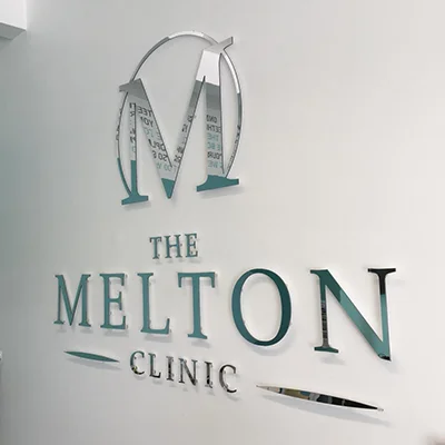
We crafted a brand identity for The Melton Clinic that was both modern and sophisticated. This involved designing a sleek logo and choosing a colour palette that conveyed professionalism and trust. The branding was intended to reflect the clinic’s commitment to high-quality dental care while maintaining a contemporary and clean aesthetic. - Designing the Signage:
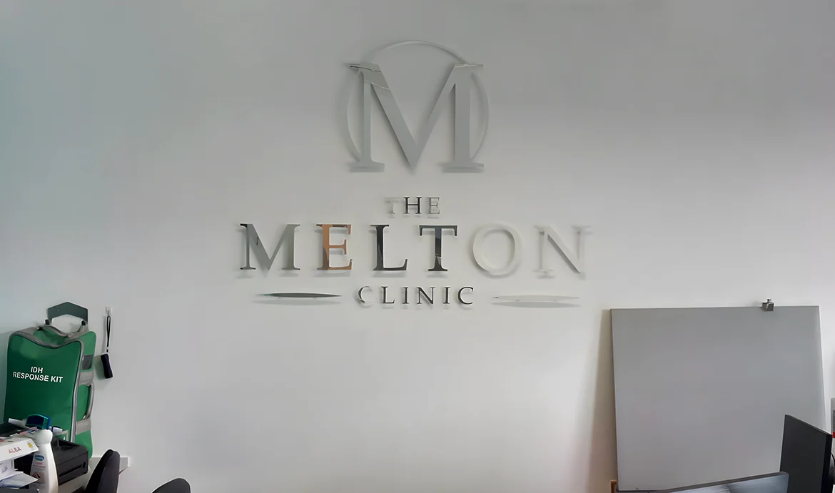
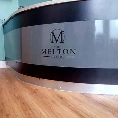
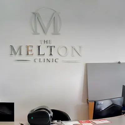
The signage was designed to align with the brand identity and the counter facia. We used high-quality materials and finishes to create a refined look that matched the clinic’s interior design. The signage included the clinic’s logo and key information, presented in a minimalist style to ensure it complemented the counter facia without overwhelming the space. - Ensuring Design Consistency:
To achieve a cohesive appearance, we carefully matched the signage materials and finishes with those used in the counter facia. This included selecting similar textures and colours to ensure that the signage and counter facia appeared as part of a unified design. We also considered the placement and size of the signage to ensure it was both functional and visually balanced within the space. - Implementation and Installation:
We managed the installation process to ensure that the signage was mounted precisely and securely, preserving the integrity of both the signage and the counter facia. The installation was carried out with attention to detail, ensuring that the final result was polished and professional.
3. The Result: A Harmonious and Professional Presentation
The final signage solution for The Melton Clinic successfully achieved the desired sleek and professional look. The signage not only matched the counter facia but also enhanced the overall aesthetic of the clinic.
The cohesive design contributed to a welcoming and high-quality impression for patients, reflecting the clinic’s commitment to excellence in dental care. The careful integration of the signage with the existing interior elements helped create a polished and unified appearance, reinforcing the clinic’s brand identity and enhancing its professional image.
Overall, the project demonstrates our ability to deliver tailored signage solutions that align with existing design elements, providing a refined and cohesive look that meets the highest standards of professionalism.

